In a view he painted often, the one from his upstairs window in East Bergholt House, we can see amid the green – the same green Constable’s contemporaries were to find so unpleasant – and way off across the fields, the rectory where Maria stayed when visiting her grandfather. It is easy to imagine that the besotted Constable painted the distant house in a swoon of bitter-sweet melancholy, maybe even a mood of veneration. You could call it a kind of long-distance portraiture, with the house standing in for a model one remembers with fervour, but whose face one is only permitted to see in the mind’s eye.
The art critic Alastair Sooke went further than this. During a bicycle ride around the artist’s haunts, he remarked of the painting that ‘the space between them [Constable’s house and the rector’s] is heavy with symbolic longing. There’s something visible, but just out of reach.’
Now, I haven’t seen all the examples of Constable’s treatment of this view. Some may well be as anguished as a few of his much later paintings, after Maria (who eventually became his wife) had died, leaving him bereft and caring for seven children, but the example that Sooke was talking about is a fairly idyllic scene, unremarkable in its emotion. There is no hint of frenzy in its brushstrokes, no trace of violent impasto, or the cut and thrust of a palette knife. One has to ask, therefore, just howheavy is this space with ‘symbolic longing’? If one was unaware of the artist’s predicament concerning the tiny reddish house on the horizon, would the intervening space be charged with any kind of emotion, apart from contentment?
Probably not. Instead, what would have been viewed by his fellow artists at the Academy as just another ‘green thing’ stands before us, now, as inoffensively pleasant, with no more suggestion of erotic charge or thwarted desire than if it had been painted after the Constables were united in matrimony. Mr Sooke was projecting feelings (about which he had read) back into the picture, under a romantic impulse all his own, simply because whether or not they were the artist’s feelings is impossible to prove.
This all sounds a million miles away from the Royal Academy’s latest show on the greatest of all modern artists, called simply ‘Picasso and Paper.’ In the matter of legibility, the old Cubist is at the opposite extreme from the old romantic. Yet, regardless of their difficulty, we always try to readpictures and divine their meaning, some because they seem too simple, others because they appear complicated, in order to find something to say. In order to render Constable more exciting than he really is, and prove his work does not belong on a chocolate box, we project emotions into some of his canvases that have no congruity with his subject matter. If that fails to impress, we remind people how the French liked him, so he can’t possibly be dull. The only ‘longing’ in this essentially composed, tranquil landscape is ours – for the scene to be more interesting than it is.
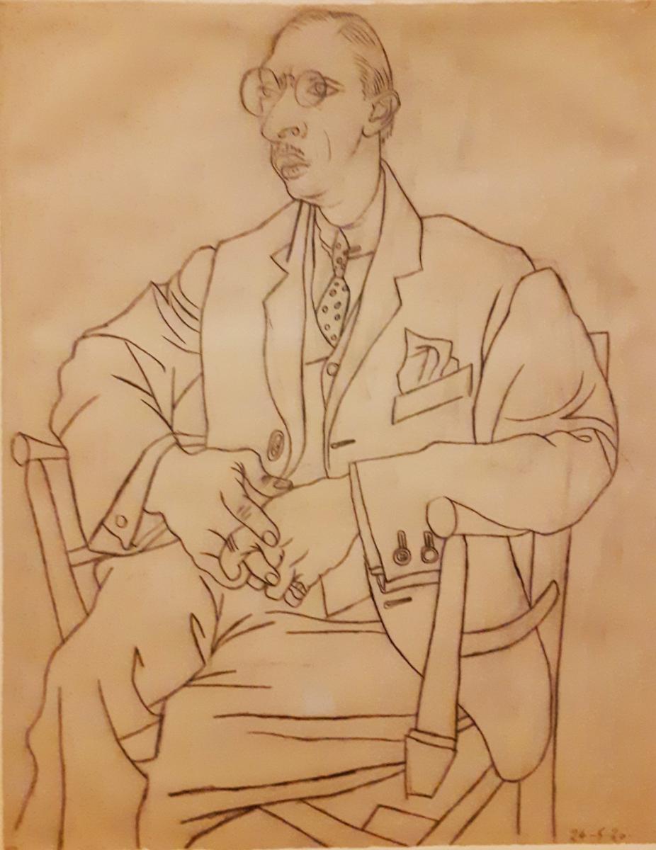
With Picasso, the opposite seems to apply: one assumes there is something difficult about him, something that will require explanation, and that he is ‘interesting’ as a matter of course. I first came to him, decades ago, with the assumption that he would be opaque. For my sins, I have approached Cubism as many times as I’ve had a stab at comprehending the theory of relativity, and emerged none the wiser from both, yet without any resentment over wasted effort because, just like Einstein, Picasso is supposed to be difficult. With life, so with Picasso, no one ever said it would be easy. Okay, there are the blue and the rose periods, and the occasional brief episode where he reverts to a simple, naturalistic style, like the beautiful line drawing portraits of Stravinsky and his milieu displayed in this exhibition.
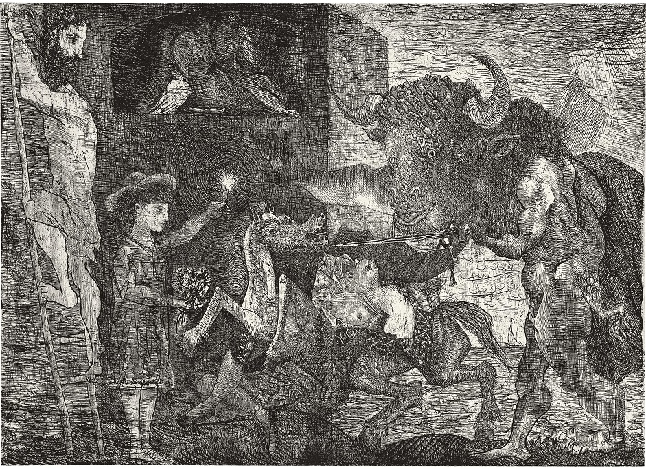
Of course, I’m a grown-up – these days, a very grown up – and I can take it. I can live with the disarranged faces, the peculiar anatomies, the repeating minotaur motif, the rapes and the disembowelled horses. But with a picture like La Minotauromachie (1935), I’m still as baffled by its meaning as I ever was. Instead of comprehension, I’m left only with a sense of the artist’s virtuosity.
Oddly enough, it’s the same quality I detect when looking at the smirking, slightly sexless figures in Leonardo’s pictures. The old master patented that smirk and it has haunted art historians ever since, demanding an explanation. It is the smirk of high art as in-joke, sealed off from interpretation, laughing at a private thought. This limitless opacity, this sense of something forever illegible, is hard to find in any other Renaissance painter. There’s nothing opaque about Michelangelo’s Moses. Even less about Botticelli’s Venus.
In Picasso’s case, he seems to have picked up the bad habit from Braque, because before his Cubist period the Spaniard was perfectly legible. Once their experiments were in full swing, whether in what the art historians call the analytic or the synthetic phases of the style, both the Cubists disappeared from view behind a curtain of difficulty, the same curtain the demoiselles had hidden behind for so long. The art lover is confronted by what Tim Hilton (of whom more later) once called the ‘haughty privacy of Cubism.’
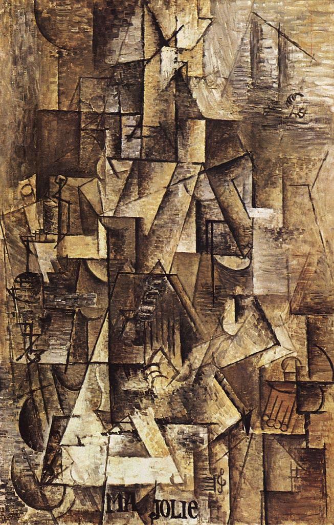
I say all this as a huge admirer of the Cubist thing. I love the nicotine-stained collapse of its still life scenes, the strange pyramidal structures, the browns and ochres and disembodied scraps of lettering. I love all that, yet I am dubious (and this doesn’t apply in Einstein’s case) when it comes to the theory. Soon after leaving Braque and taking up with the ballet, Picasso reverted, jarringly, to a rather prissy style. It was almost as if the strain of all that fearless experimentalism had exhausted him. The self-styled mountaineer and Wright brother, now free of his mountaineering, aviator chum, craved the relief of less arduous terrain.
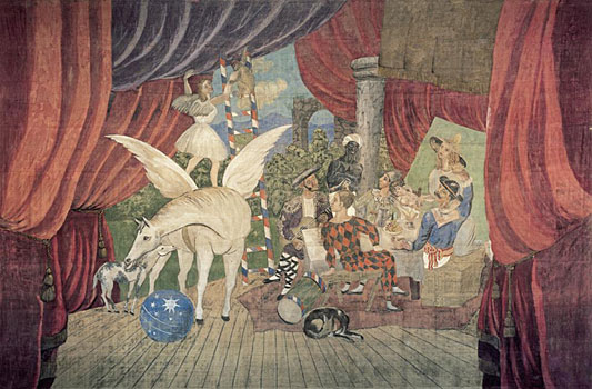
There, that’s better. No self-denying ordinances here. Instead, a Pegasus that could have been painted by a prepubescent boy, and a joyous return to the conviviality of his circus performers, the ones he’d been painting before he encountered the African masks, long before he heard of Braque.
Ballet, as it turned out, was really only a blip. Picasso was a modern artist; there was to be no turning back, and modern art meant illegibility. Yet his illegibility in the wake of Cubism is not the same. With the brown studies of Braque and Picasso, it is the attempt to see how they travelled around the object or face, the effort to retrace their movements, that frustrates. One feels it would have been simpler if they’d gone all the way and dissolved every last vestige of representation. Braque is braver in this respect; it is Picasso who clings to the likenesses of his sitters, who first throws in a bit of sentiment in the inscription MA JOLIE, or who lets a sense of the ridiculous creep past the high artistic censor in his head when he depicts a Man Smoking a Pipe. After the brief escape into the realm of Diaghilev (excuse for another such pipe smoker, this time a ‘costume’), Picasso came up with the style one associates with him, a trick of representing the world, but taking Cubist liberties with that representation. This is where we see the faintly ridiculous, which appeared in the pipe smoker, triumph in the form of caricature.
As far as the rarefied air of the heights of style went, this was an admission of defeat. Whereas the opacity of Cubism was a question of almost indiscernible method, the new opacity was the development of a kind of idiolect, a hermetic insistence on Picasso’s personal mythology which disappoints, I think, even at its most virtuosic, because it is ultimately illegible. One sees this in the disarranged faces, the peculiar anatomies, of the endless portraits and nudes. It’s also there in the minotaur motif, the rapes and the disembowelled horses, of what we might call his Arcadian theme.
A picture like La Minotauromachie, for instance, baffles in a different way to Cubism. The title explains something of the origin of the motifs. Picasso never lets us forget he’s Spanish, after all. If he’d been a Scot, his work would have abounded with bagpipes and tartan. There are so many guitars, so many bullfights, it all gets a little bit wearisome after a while, but there is something else more specific behind this engraving – the series of bullfight engravings by his illustrious compatriot, Francisco Goya. That ladder in the left of the picture, for example, seems to be a recollection of the ladder in one of Goya’s prints, also on the left of the design.
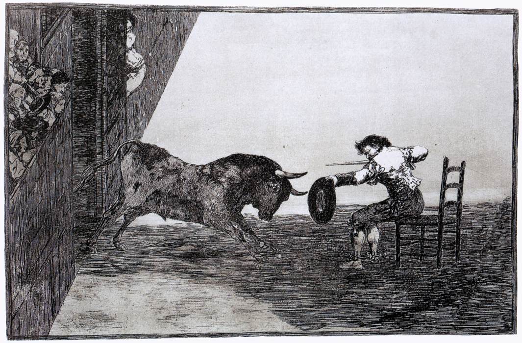
Alfred Barr, the first director of the Museum of Modern Art in New York, remarked that ‘apparently the scene is a moral melodramatic charade of the soul, though probably of so highly intuitive a character that Picasso himself could not or would not explain it in words.’ This seems like a very measured response to what is, contrary to the Goya work in its DNA, an illegible picture. Sadly, the entire story of Picasso/Minotaur is equally hard to read. He can be seen lounging next to sinuous naked ladies with a glass of wine in his hand, or assaulting a naked woman as she sleeps, but he can also be blind and led by a girl with a bouquet of flowers past fishermen. He has innumerable adventures, this half-man-half-beast, but we are really none the wiser as to why.
Opacity is all, the smirk of the in-joke. With Picasso, the motivation is different to the old master’s. He shows no interest in the religious or mystic possibilities of the opaque. Instead, we get the imprimatur of high art in a secular age, or possibly a pagan one. Picasso churned out works that fit the opaque category for decades, perhaps as a constraint on his other main impulse, the urge to caricature. It’s hard to take the weirdest of his nudes seriously, for example, rather than accepting them as a form of sport with the female form, as if beyond his lust the Minotaur found all those Theban virgins funny to look at. When he manages to hide his smirk behind his hand, Picasso resorts not to fine painting, but to opacity. It’s his way of pretending to be deeper than he really is, just as surely as Leonardo’s smirk could be a way of pretending to be holier than thou.
This opacity really came home to roost in Guernica. It was the culmination of a string of Minotaur and animal-themed pictures that Tim Hilton, art critic from the seventies, preferred to the eventual product. It is probably the single most well-known piece that Picasso ever did. Thanks to Dora Maar, we know how it developed, along with the changes – notably the decision not to include a defiant fist – and, thanks to the Royal Academy, we can also see its origins in sketches, such as this one of a horse in agony.
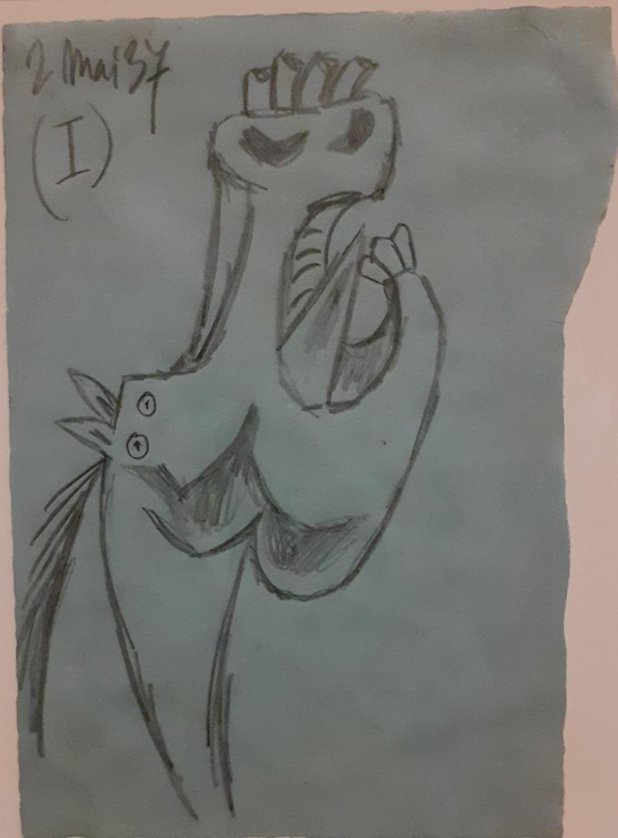
Guernica is his most famous image, yet is it a successful one? A form of triptych, it sought to respond to the bombing of the defenceless citizens of a Basque town by the Germans, a way of demoralising the defenders of the Republic against Franco’s rebellion. Picasso had read about the incident in a newspaper report by George Steer, which first appeared in the The Timesand was reprinted in L’Humanité.For the artist, whose friends commented on his remarkable lack of interest in politics up until that period, it was a turning point. Before setting to work on the massive mural, he attacked Franco in a series of etchings intended to be propagandist postcards, depicting the fascist leader as a polyp, a louse, possibly a turd, one minute genuflecting in front of – well, what exactly? – surrounded by barbed wire, then doing battle with a bull, then masquerading as a richly-attired Spanish lady complete with fan.

The general is a grotesque caricature of the kind high art could not, according to Hilton, hope to encompass, and by the end of the series Picasso was already etching pictures that were closer to his vocation: the figure of Franco could still be seen, cavorting around, but in some ‘postcards’ he is replaced by tragic images of war that resemble the animals and women in Guernica.
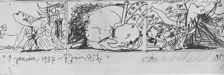
The move in the etchings is essentially as I have already described, though: from caricature to opacity. The same applies to the finished mural, though if anything the move is incomplete, so there is something almost insultingly caricatured in the figures of the women to the right, while the horse, the bull, the broken statue of the soldier all carry the burden of a personal code. It is easy to see, on a visceral level, that the figures are tortured and afflicted as all victims of war must be. One just, inevitably, wonders why they are assembled here, on this ambiguous set, and why the light bulb (possibly a pun involving the Spanish word bombilla?), and why the appearance of newsprint in the hide of the agonised horse? In striving to make a political statement, the very private high priest of modern art had to find a language that could be understood on the streets, in the popular press, among his persecuted people. This probably wasn’t possible any longer. The penurious bohemian turned genius of the age might have toyed with the idea of a return, however briefly, to the simpler messages of his blue period, rather in the way he had consciously abandoned the esoteric to illustrate a ballet. But he resisted, and the opacity of Guernica, with its very private symbolism, was the result.
This, in words far more eloquent than mine, was Tim Hilton’s assessment:
‘it is a vaguepainting. Nobody knowns what is going on in it, and it is the merest literary double-talk to maintain that this is what gives it universal application. The vagueness is iconographic: there is no possible reading for the bull, the dominant figure, because it is always possible the bull might stand for something else. But it is also pictorial: why should we have to decide whether the light in this barn is electric or supernatural?... Guernicais the opposite of a breakthrough. It does not have a true concinnity of artistic intention, but broods competently on its political and old-master assumptions. The best things about Guernica are its first impulses, the gesso drawings and certain subsequent spin-offs – though some of those, like the too-celebrated Weeping Woman, protest too much.’
Who knows, maybe the picture has endured longer because of its difficulty. Back in the seventies when Hilton was writing about this, he admired the drawings, the earlier efforts, apparently convinced that Picasso had worked it up too much from these promising beginnings. The Academy’s exhibits offer ample opportunity to judge what was gained and what was lost.
But something of what Hilton himself represents has, in turn, been lost to us as viewers, and the loss may be Picasso’s too. Throughout his little book, Hilton is scathing about the inevitable flops in the great artist’s long career. He dislikes the ceramics in particular, witheringly referring to them as beneath the attention of a great artist and the place where his Arcadian theme ‘came to its inglorious end.’ Where does he get this somewhat magisterial view from? It’s hard to remember, in an age when art has so completely gone off the rails, that there was a sense back then of a linear progression. Take Hilton’s description of what happened to Picasso when he dabbled in the ballet:
‘various things – the war, Braque’s departure, the sheer impossibility of maintaining Cubism on a high level – combined now to slacken Picasso’s impulse to make progressive art.’
Is it just me, or doesn’t that reference to ‘progressive art’ sound oddly old-fashioned, quaint almost, from the vantage of an art world frequented by people like Jeff Koons? In the present situation, judged by Hilton now, we would all look like slackers. Is it possible there are artists in Germany who still think like this? There are none here, that’s for sure, nor are you likely to find them in New York or Paris.
Here are two more assertions from Hilton:
‘…unfortunately or not, there is never any room for humour on the highest levels of art, nor for parody.’
And again,
‘...the wish to shock … is clearly a miserable artistic ambition.’
Fifty years on, these fossilised views sound quaint beyond belief. It has taken half a century for art to capitulate, utterly, to the temptation that seems to haunt Picasso’s worst work, the descent into caricature or in-joke. The idea of progress is gone. In its place is the hollow laughter of a banana stuck to a gallery wall, or a graffito translated to a big auction house that shreds itself. Look at the ceramics and perhaps the quaint art critic was right: Picasso was heading that way. But what Hilton mistook for the old boy’s senility, was in fact a premonition of things to come.
One is bound to ask, given the manifold disappointments that this great modern artist served up on his very own ceramic plates, whether anyone actually likesPablo Picasso anymore. Ask this question of an expert in the auction houses and, if they spare you the fancy talk, they will simply quote the prices back at you. Take this delicate, rather sparse landscape, which in all probability took him just under ten minutes to paint:
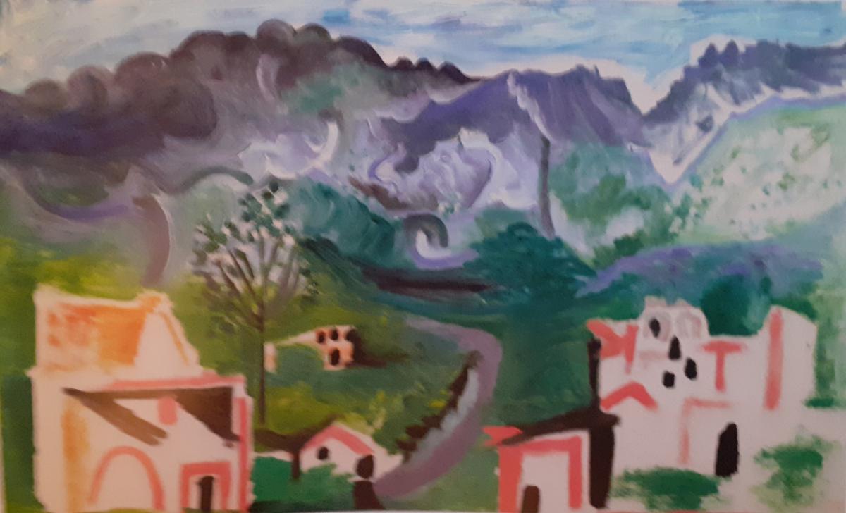
Landscapes were really not Picasso’s forte. He was far happier holed up in his studio where his latest model could disrobe, though with a piercing stare like his, he could probably have saved her the trouble. This landscape is exceptionally poor. It is what the art connoisseurs know, technically, as a daub, yet it is on sale at Christie’s for between 2,500,000 and 3,500,000 pounds.
So yes, miraculously, people still like him, as an investment. It really doesn’t matter much what he did in his ‘progressive’ phase, as no one believes in artistic progress anyway. Besides, even Picasso’s senility is an improvement on the collective senility that is contemporary art. The fact is, we can’t really see him anymore, so many dejected installations and Rauschenberg clutters down the line, so many lights wittily turning on and off. The lineage has been erased. The line of contact that he held onto, with classical myth in his Arcadian pictures, with masters like Rembrandt in the Vollard Suite, has snapped.
After visiting the Academy, I went off to find the small Sprovieri Gallery nearby. It was not easy to locate, but there – near David Bowie’s telephone kiosk, the one on the cover of ‘Ziggy Stardust’ – I eventually tracked down a contemporary version of Guernica. At the top of a narrow stairway, partially obscured by a pillar, hung on a stark white wall, was a different Guernica, black and white like the original, but barely discernible (i.e., even more illegible) beneath a superimposed Jackson Pollock. In the leaflet that went with the work I found a statement by the artistic group responsible, Art & Language, extracted from an essay called, appropriately enough, Making Meaningless:
‘For us, Conceptual Art was never a mature professional style but a black box (or a black box in a black box); what is sometimes called “a genuine historical moment” changing forever what happened “next”. What happened in that moment inaugurated a process and a project. And it was given to this project to recognise that there continue to be baffling relations between text, pictures and painting, and that the expulsion of the two latter from the purview of the artist is a cheap closure which fails to recognise the constructedness [sic] of the world… Art & Language’s practice has been project-like and essay-like. And this entails that it must be a critical practice… a collaborative practice. Work, in the sense of non-wordy action and its consequences, is embedded and then re-embedded in conversation, until the edges of what is work and what isn’t work vanish and ten reappear in different places.’
Understandably, I was none the wiser after reading this, so I sought further guidance from Simone Acca at the gallery, who kindly informed me in an email:
‘The reason behind the choice of Picasso’s Guernica and Pollock’s style lives in the possibility to create, embodying the two, a monstrous clash of two culturally and artistically asymptotic things. The main theme remains that of “disguise”: what do we lose of Guernicawhen it is restaged as a Pollock, and what do we lose of Pollock when his work is restaged as Guernica?’
I wrote back to say I reckoned Picasso had definitely come off worse from the encounter, but when I looked at my photo, taken at an angle to avoid the pillar, I could see more of his work than I’d noticed at the time.
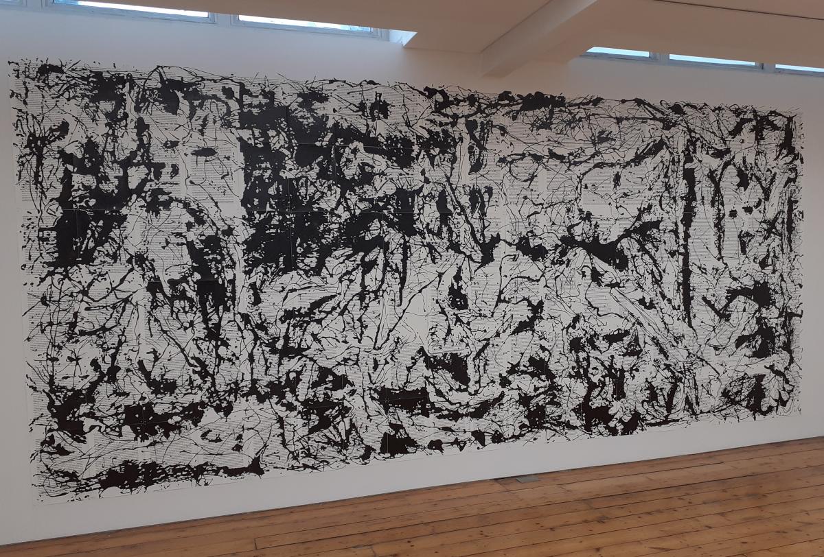
Nonetheless, in terms of any political message left in Guernica, this superimposition of Pollock was the equivalent of the Spanish state’s Pact of Forgetting. It finally nullified what was already a compromised attempt at political statement and commemoration. But who, in all honesty, could care less about a dated lament over a forgotten war? And so what if Pollock effortlessly won the day? He only did so at the expense of losing his own meaning too.


